“A worldwide epidemiological database for COVID-19 at fine-grained spatial resolution” by COVID-19 Data Hub developer, Emanuele Guidotti was published in Scientific Data on the March 28, 2022, and is available to view online at https://www.nature.com/articles/s41597-022-01245-1 (DOI 10.1038/s41597-022-01245-1).
The R Consortium is proud to be a sponsor of the COVID-19 Data Hub. We believe that the need for accessible, organized, official COVID-19 case data will persist for some time into the future, and that the COVID-19 Data Hub is a serious contribution to science and public health.
— Joseph B. Rickert, Chair R Consortium Board of Directors
PAPER ABSTRACT
This database provides the daily time-series of COVID-19 cases, deaths, recovered people, tests, vaccinations, and hospitalizations, for more than 230 countries, 760 regions, and 12,000 lower-level administrative divisions. The geographical entities are associated with identifiers to match with hydrometeorological, geospatial, and mobility data. The database includes policy measures at the national and, when available, sub-national levels. The data acquisition pipeline is open-source and fully automated. As most governments revise the data retrospectively, the database always updates the complete time-series to mirror the original source. Vintage data, immutable snapshots of the data taken each day, are provided to ensure research reproducibility. The latest data are updated on an hourly basis, and the vintage data are available since April 14, 2020. All the data are available in CSV files or SQLite format. By unifying the access to the data, this work makes it possible to study the pandemic on a global scale with high resolution, taking into account within-country variations, nonpharmaceutical interventions, and environmental and exogenous variables.
by Emanuele Guidotti & David Ardia, originally published in the Journal of Open Source Software
In December 2019 the first cases of pneumonia of unknown etiology were reported in Wuhan city, People’s Republic of China.[1] Since the outbreak of the disease, officially called COVID–19 by World Health Organization (WHO), a multitude of papers have appeared. By one estimate, the COVID-19 literature published in January-May 2019 has reached more than 23,000 papers — among the biggest explosions of scientific literature ever.[2]
In response to the COVID-19 pandemic, the White House and a coalition of leading research groups have prepared the COVID-19 Open Research Dataset[3], a resource of over 134,000 scholarly articles about COVID-19, SARS-CoV-2, and related coronaviruses. The Center for Systems Science and Engineering at the Whiting School of Engineering, with technical support from ESRI and the Johns Hopkins University Applied Physics Laboratory, is maintaining an interactive web-based dashboard to track COVID-19 in real time[4]. All data collected and displayed are made freely available through a GitHub repository. [5] A team of over one hundred Oxford University students and staff from every part of the world is collecting information on several different common policy responses governments have taken. The data are aggregated in The Oxford COVID-19 Government Response Tracker[6]. Google and Apple released mobility reports [7][8] to help public health officials. Governments all over the world are releasing COVID-19 data to track the outbreak as it unfolds.
It becomes critical to harmonize the amount of heterogeneous data that have become available to help researchers and policy makers in containing the epidemic. To this end, we developed the COVID-19 Data Hub, designed to aggregate the data from several sources and allow contributors to collaborate on the implementation of additional data providers.[9] The goal of our project is to provide the research community with a unified data hub by collecting worldwide fine-grained case data, merged with exogenous variables helpful for a better understanding of COVID-19.
The data are hourly crunched by a dedicated server and harmonized in CSV format on a cloud storage, in order to be easily accessible from R, Python, MATLAB, Excel, and any other software. The data are available at different levels of granularity: 1) administrative area of top-level, usually countries; 2) states, regions, cantons; 3) cities, municipalities.
The first prototype of the platform was developed in spring 2020, initially as part of a research project that was later published in Springer Nature and showcased on the website of the Joint Research Center of the European Commission. The project was then started at the #CodeVSCovid19 hackathon in March, funded by the Canadian Institute for Data Valorization IVADO in April, won the CovidR contest in May, presented at the European R Users Meeting eRum2020 in June, and published in the Journal of Open Source Software in July. At the time of writing, we count 3.43 million downloads and more than 100 members in the community around the project.
COVID-19 Data Hub has recently received support by the R Consortium[10], the worlwide organization that promotes key organizations and groups developing, maintaining, distributing and using R software as a leading platform for data science and statistical computing.[11]
We are now in the process of establishing close cooperation with professors from the Department of Statistics and Biostatistics of the California State University, in a joint effort to maintain the project.
[3] Wang, Lucy Lu, Kyle Lo, Yoganand Chandrasekhar, Russell Reas, Jiangjiang Yang, Darrin Eide, Kathryn Funk, et al. 2020. “CORD-19: The Covid-19 Open Research Dataset.” arXiv Preprint arXiv:2004.10706.
[4] Dong, Ensheng, Hongru Du, and Lauren Gardner. 2020. “An Interactive Web-Based Dashboard to Track Covid-19 in Real Time.” The Lancet Infectious Diseases 20 (5): 533–34. https://doi.org/10.1016/S1473-3099(20)30120-1.
[6] Hale, Thomas, Samuel Webster, Anna Petherick, Toby Phillips, and Beatriz Kira. 2020. “Oxford Covid-19 Government Response Tracker.” Blavatnik School of Government.
Citizen science is a critical engine for creating professional tools that become new standards in epidemic outbreak response. The problem is connecting people on the front lines – “COVID-19 response agents” – and people with R language skills.
The R Consortium awarded RECON a grant for $23,300 in the summer of 2019 to develop the RECON COVID-19 challenge, a project aiming to centralise, organise and manage needs for analytics resources in R to support the response to COVID-19 worldwide.
The COVID-19 challenge is an online platform whose goal is to connect members of the R community, R package developers and field agents working on the response to COVID-19 who use R to help them fill-in their R related needs.
Field agents include epidemiologists, statisticians, mathematical modellers and more.
The platform provides a single place for field agents to give feedback in real time on their analytical needs such as requesting specific analysis templates, new functions, new method implementation, etc. These requests are then compiled and organized by order of priority for package developers and members of the R community to browse and help contribute to.
One example is scoringutils. The scoringutils package is currently used by research teams in the UK and US. It is also set to be deployed on a larger scale as part of the evaluation for the US Forecast Hub which is the data source for the official CDC COVID-19 Forecasting page.
TIBCO Spotfire is a unique platform that combines advanced visualization and data science techniques. The culmination of its capabilities can be demonstrated in TIBCO’s COVID-19 Visual Analysis Hub. Allowing complex algorithms to run in the background, the application boasts a simple, interactive interface that lets any type of user learn more about the current state of the pandemic. In this blog, we will take a deeper look at the inner workings of the dashboard and explore some of Spotfire’s special functionality, as well as some technical and statistical innovations.
This high-level blog is split into three sections: Data Science Functions, Data Visualization Methods, and Data Engineering(coming soon). Within each section, there will be subsections where you can learn more about specific tools & methods that we used. In addition, some of these subsections will contain links to more detailed blogs—allowing you to read content tailored to your interests.
Feel free to have a look at our Visual Analysis Hub to get a better idea of the work that went behind building it.
Details on Hub’s Data Science Functions
There is much uncertainty about the current state of the pandemic. Recent outbreaks across the world prove that it is hard to pinpoint and contain the coronavirus. Here at TIBCO, our recent work has been focused on trying to make tangible estimates about the actual trends in the data, while also facing the reality that there is only so much that we can be certain about.
One road towards understanding the coronavirus is trying to fit the epidemic curve of the data.
Due to its nature, the case and death data that we observe can be sporadic, confusing, and can take on many different shapes. For creating fit lines, we have adopted two different methodologies: Friedman’s Supersmoother and GAMLSS, a modified version of generalized linear models. This work is done to create the lines seen above, which you can interpret as a summarization of how the data has evolved over time.
Friedman’s Supersmoother:
A large, persistent issue that we continue to face with case growth analysis is the flood of bad/missing data as well as misreported or non-reported data. Some regions have had weird spikes, some have had thousands of cases reported the day after 0 cases were reported (misreporting), etc. In order to overcome these mishaps, we need to use methods that focus on the overall trend of the data and do their best to ignore the noise. As such, we have experimented with different smoothing methods including moving averages and LOESS, but eventually settled on Friedman’s Supersmoother due to its ability to overcome outliers and its lack of hyperparameter tuning. Our implementation of the method used the ‘supsmu’ function found in R’s stats package. Below is a snippet of our code:
Snippet of R Code for Supersmoothing in the COVID-19 Application
In more technical detail, the Supsmu function is a running line smoother that chooses a variable k such that there are k/2 data points on each side of the predicted point. k can be any number between (0.01)*n and n, where n is the number of total data points. If the span itself is specified, the function implements a single smoother with (inputted span)*n used as the span (Friedman, 1984). We run this method for each set of dates in each region using data.table in R and then append the results back into the original data with each region’s corresponding smooth values.
Friedman’s Supersmoother helps to give a relatively noise-free smooth curve that can model the case growth well across regions and differently shaped data. Additionally, we have noticed that the method has adapted well over time. Since surpassing ~six months of data, the input size that is fed into the supersmoother has become quite sufficient and therefore has created increasingly accurate fit curves.
GAMLSS/Nearcasting:
The other method we have explored is GAMLSS, Generalized Additive Models for Location Scale and Shape. This method is valuable and has become one of our favorites because it includes a notion of uncertainty when fitting models on data. Rather than making concrete estimates/predictions about the data, the GAMLSS method provides a range of possible outcomes at any given point in time. You are not just looking at one line that assumes the true shape of the data, but instead you can look and explore multiple estimates of what the trends might look like. For more detailed information about GAMLSS and our processes, we have written a whole blog on the subject, so please check it out!
Another important question that many people want to understand is how COVID-19 trends are going to look like in the near future. To try and answer that question, we experimented with some common and uncommon methods for predicting the amount of coronavirus cases in the next week. An interesting challenge that emerged was the process of choosing an approach for dealing with inconsistent reporting and outliers when modeling. We discovered that some lesser known modeling techniques can prove to be advantageous under certain conditions. You can read the results of our analysis here.
GAMLSS Model Evaluated on California (10/28)
In our Live Report, we use GAMLSS through data functions in Spotfire as a way to fit epidemic curves and make predictions over the next week based on the current trends. Above is an example of running GAMLSS on parts of the San Francisco Bay Area. By choosing counties in the left panel, the coronavirus case data associated with these regions is sent as an input into a data function that creates and runs the models. Inside that data function, we are simply running code written in R that will output three epidemic curves fit to the input data (one for the 10th, 50th, and 90th percentile of the GAMLSS model–the ‘range’ of outcomes). These output lines are then overlaid with the case data on the bottom right panel of our page. Easily configured with visualizations, the data function is capable of running its complex scripts over an interactive user interface. This page can be accessed from the home page by clicking on the “View Forecasts” button. To learn more about how you can integrate R and Python functions with Spotfire, check out our community.
The integration of data science functions in TIBCO’s COVID application demonstrates Spotfire’s ability to coincide statistical analysis with a visual framework. Next, we will take a look at the data visualization techniques used in our dashboard.
Details on Hub’s Visual Functions
Business Reopenings:
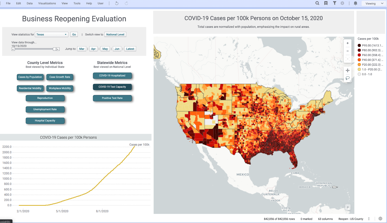
Keeping in mind that each country, and each province within each country, might have different rules and regulations regarding reopening, businesses need a view of all essential metrics that can help them understand the current situation in their region—subsequently assisting them to plan a reopening according to local rules and regulations. To help supplement this decision-making, we created a ‘Business Reopening’ page on our application that provides a one-stop look at all the essential metrics. Through interactive buttons, sliders, and maps, users can evaluate how the pandemic is progressing in their region.
Above is a look at our ‘Business Reopening’ page. This page includes deep drills into unemployment rates, case growth, and mobility—all from different verified sources. In its many interactive features, there is the capability to switch abstraction levels from a geographical perspective, filter results by circling areas on the map, and adjust a slider to look at the analysis at different points in time. Under the hood, when these interactive elements are invoked, the command is sent to a Spotfire data function, which recomputes the analysis and sends the results back to the now updated visualizations.
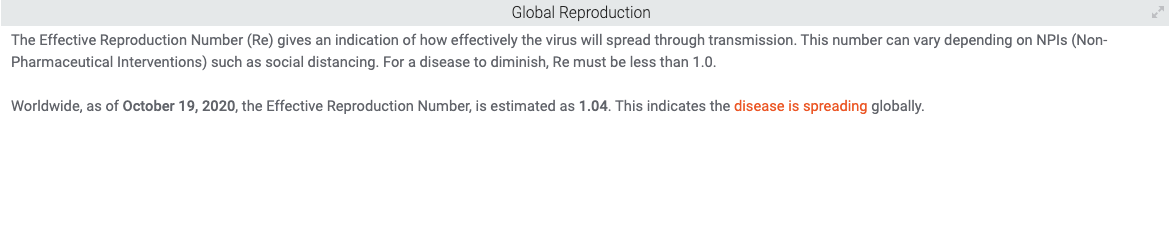
Here are some examples of different county level metrics we have in the page. All of these can be drilled down into a specific state or at the national level and have detailed views for both:
Reproduction estimates at the County Level
Workplace Mobility in different counties in the State of Virginia
Natural-Language Generation (NLG):
To make the COVID-19 Hub more accessible and understandable for any type of user, we utilize Arria’s NLG (natural-language generation) tools across our application. NLG augments the analysis by building a narrative that is not just charts and graphs, but instead generates detailed insight into what is happening through language.
By gathering information from the data, the NLG tool is able to produce sentences that summarize the data, and do so without making the text sound like it came from a robot. In an excerpt from TIBCO’s website, Arria NLG is described, “Through algorithms and modeling, Arria software replicates the human process of expertly analyzing and communicating data insights—dynamically turning data into written or spoken narrative—at machine speed and massive scale.” The NLG tool is available as a visualization type within Spotfire.
Newspaper style:
The COVID-19 Application uses what is called a Newspaper style layout for visualization within Spotfire. This layout helps in overcoming limitations that can come from a fixed length layout. For example, if a page of an application is non-scrollable, it doesn’t allow you to add as many charts and visualizations as you might want. Instead, you are limited to charts that would be visible to the naked eye and that could fit into the size of a page. The Newspaper style format in Spotfire benefits in making it possible to add as many visualizations as you want and present a logical flow of information that can enrich your insights.
You can easily configure Spotfire’s Page Layout options to extend the page length to make your dashboard newspaper style and take advantage of all the real estate that you can get. This is done by right-clicking on the page navigation bar and configuring the Page Layout to your desire (video tutorial). Here is a quick GIF of how we use newspaper style formats in the COVID-19 Application:
Summary and Future Work
There are many dimensions needed to understand an issue as complex as the coronavirus pandemic. From analyzing hospitalization data to visualizing epidemic curves, TIBCO’s Visual Analysis Hub converges data science, data visualization, and data engineering in one central application. Utilizing Spotfire, these disciplines are used in harmony to deliver insights about the state of the pandemic to just about any type of user. We hope that you were able to learn a bit more about the statistical and technical work that went into our Visual Analysis Hub.
This blog will serve as the central location for any more blogs/updates regarding the development of our COVID dashboard, so be sure to come back and read more about the work that we have done!
Here, again, are the links to the topic-focused blogs:
Thank you to everyone who has contributed to the COVID Visual Analytics Hub and, in particular, a shout out to David Katz, Prem Shah, Neil Kanungo, Zongyuan Chen, Michael O’Connell, and Steven Hillion for their contributions towards creating these blogs and analyses.
The R/Pharma virtual conference this year was held October 13-15th, 2020. R/Pharma focuses on the use of R in the development of pharmaceuticals, covering topics from reproducible research to drug discovery to genomics and beyond.
Over 1,000 people signed up for the 3 day, free event this year!
Designed to be a smaller conference with maximum interaction opportunities, R/Pharma was a free event that allowed keynote speakers in the R world to present their research and findings in ways that allowed for maximum viewer participation.
All presentations are given in ways that showcase using R as a primary tool within the development process for pharmaceuticals.
If you are interested in seeing some of the exciting work showcased at R/Pharma from the R Validation Hub, you can do so below. The R Validation Hub is a cross-industry initiative meant to enable use of R by the bio-pharmaceutical industry in a regulated setting. The presentations Implementing A Risk-based Approach to R Validation by Andy Nicholls and useR! 2020: A Risk-based Assessment for R Package Accuracy by Andy Nicholls and Juliane Manitz are available for viewing. Learn about risk assessment and assessing package accuracy with the R Validation Hub team!
The second COVID-19 Data Forum, co-sponsored by the Stanford Data Science Institute and the R Consortium, was held August 13, 2020. This series of forums brings together experts working to collect and curate data needed to drive scientific research and formulate effective public health responses to the pandemic.
The forum utilized Zoom as the video platform and allowed keynote speakers to present, as well as interact during a Q&A session.
The moderator was Sherri Rose, an associate professor at Stanford University in the Center for Health Policy and Center for Primary Care and Outcomes Research and Co-Director of the Health Policy Data Science Lab.
Speakers covered topics such as current issues facing researchers during the COVID-19 pandemic such as data sharing or research duplication, how phenotype impacts severity of cases, and data inequality for under-serviced communities. Speakers also answered questions from the moderator and the chat about their work and ways individuals can get involved at all R literacy levels.
Thurs, August 13th, 9am PDT/12pm EDT/18:00 CEST – Register now!
Hosted by the COVID-19 Data Forum/Stanford Data Science Initiative/R Consortium
COVID-19 is the first pandemic to occur in the age of open data. Public health agencies around the world are releasing case counts to the public, and scientists are providing analyses and forecasts in real-time. However, the content of this data has so far been limited to simple metrics like cases, deaths, and hospitalizations at coarse geographic and demographic scales. To drive the next phase of COVID-19, scientists need access to higher-dimensional patient-level data, so we can understand how the virus causes disease, why are some more at risk than others, when and how is transmission occurring, what therapeutics are more likely to work, and what healthcare resources are being used. But sharing such data brings up tremendous challenges in terms of patient privacy and data standardization. The COVID-19 Data Forum, a collaboration between Stanford University and the R Consortium, is hosting the event “Beyond case counts: Making COVID-19 clinical data available and useful” to push the conversation forward on these issues. The event will include talks by representatives from international collaborative teams who are working to collect and share detailed clinical and biological data from individuals with COVID-19. The event will be open to the public, and is part of a continuing series focusing on data-related aspects of the scientific response to the pandemic.
Speakers include:
Jenna Reps, Observational Health Data Sciences & Informatics (OHDSI) Consortium /Janssen R&D
Andrea Ganna, COVID-19 Host Genetics Initiative/Harvard Medical School/Finland Institute for Molecular Medicine
Ken Massey, EndPandemic National Data Consortium/Saama Technologies
Ryan Tibshirani, DELPHI epidemic forecasting group/Dept of Statistics, Carnegie Mellon University
We are proud to announce that the R Consortium has awarded RECON a grant for $23,300 to develop the RECON COVID-19 challenge, a project aiming to centralise, organise and manage needs for analytics resources in R to support the response to COVID-19 worldwide.
These resources will permit to expand our initial preliminary collection of github issues to create a user-friendly web platform gathering R tasks reflecting needs from different projects and groups, and facilitate contributions from the wider R programming community.
We are looking for two consultants (see ‘We need you!’ section below), including:
a project manager to drive the project forward
a web developer to create the website
The RECON COVID-19 challenge in a nutshell
The RECON COVID-19 challenge aims to bring together the infectious disease modelling, epidemiology and R communities to improve analytics resources for the COVID-19 response via a website which will provide a platform to centralise, curate and update R development tasks relevant to the COVID-19 response. Similar to the Open Street Map Tasking Manager (tasks.hotosm.org), this platform will allow potential contributors to quickly identify outstanding tasks submitted by groups involved in the response to COVID-19 and ensure that developments follow the highest scientific and technical standards.
While this project is aimed at leveraging R tools for helping to respond to COVID-19, we expect that it will lead to long-lasting developments of partnerships between the R and epidemiological communities, and that the resources developed will become key assets for supporting outbreak responses well beyond this pandemic.
We are urgently looking for two consultants to get this project started. These two positions funded by the R Consortium include (click links for job descriptions):
The first COVID-19 Data Forum, co-sponsored by the Stanford Data Science Institute and the R Consortium, was held May 14, 2020. The forum used Zoom as a way to connect remote specialists, present information, and conduct a Q&A session so that participants could ask questions and give opinions.
UPDATED – Full video recording here
Close to 200 people attended, watching a range of experts cover a level of detail around COVID-19 that is not available through newspapers, and asking questions covering science and policy.
From the COVID-19 Data Forum site:
The COVID-19 pandemic has challenged science and society to an unprecedented degree. Human lives and the future of our society depend on the response. That response, in turn, depends critically on data. This data must be as complete and accurate as possible; easily and flexibly accessible, and equipped to communicate effectively with decision-makers and the public.
The COVID-19 Data Forum is a project to bring together those involved with relevant data in a series of multidisciplinary online meetings discussing current resources, needed enhancements, and the potential for co-operative efforts.
Speakers (full slides for each presentation available soon)
Orhun Aydin, Researcher and Product Engineer, ESRI
Ryan Hafen, data scientist consultant with Preva Group, and adjunct assistant professor, Purdue University
Alison L. Hill, Research Fellow and independent principal investigator at Harvard’s Program for Evolutionary Dynamics.
Noam Ross, Senior Research Scientist, EcoHealth Alliance
The Stanford Data Science Institute, which aims to give Stanford faculty and students the tools, skills and understanding they need to do cutting-edge research, is joining with the R Consortium to build the COVID-19 Data Forum series.
The COVID-19 Data Forum series is an ongoing set of online meetings that connect multidisciplinary topic experts to focus on data-related aspects of the COVID-19 pandemic modeling process such as data access and sharing, essential data resources for modeling and how we can best support decision making.
The first half of the meeting is a public webinar and all are welcome to attend.