

Originally published in the TIBCO Community Blog, by Adam Faskowitz

TIBCO Spotfire is a unique platform that combines advanced visualization and data science techniques. The culmination of its capabilities can be demonstrated in TIBCO’s COVID-19 Visual Analysis Hub. Allowing complex algorithms to run in the background, the application boasts a simple, interactive interface that lets any type of user learn more about the current state of the pandemic. In this blog, we will take a deeper look at the inner workings of the dashboard and explore some of Spotfire’s special functionality, as well as some technical and statistical innovations.
This high-level blog is split into three sections: Data Science Functions, Data Visualization Methods, and Data Engineering (coming soon). Within each section, there will be subsections where you can learn more about specific tools & methods that we used. In addition, some of these subsections will contain links to more detailed blogs—allowing you to read content tailored to your interests.
Feel free to have a look at our Visual Analysis Hub to get a better idea of the work that went behind building it.
Details on Hub’s Data Science Functions
There is much uncertainty about the current state of the pandemic. Recent outbreaks across the world prove that it is hard to pinpoint and contain the coronavirus. Here at TIBCO, our recent work has been focused on trying to make tangible estimates about the actual trends in the data, while also facing the reality that there is only so much that we can be certain about.

One road towards understanding the coronavirus is trying to fit the epidemic curve of the data.
Due to its nature, the case and death data that we observe can be sporadic, confusing, and can take on many different shapes. For creating fit lines, we have adopted two different methodologies: Friedman’s Supersmoother and GAMLSS, a modified version of generalized linear models. This work is done to create the lines seen above, which you can interpret as a summarization of how the data has evolved over time.
Friedman’s Supersmoother:
A large, persistent issue that we continue to face with case growth analysis is the flood of bad/missing data as well as misreported or non-reported data. Some regions have had weird spikes, some have had thousands of cases reported the day after 0 cases were reported (misreporting), etc. In order to overcome these mishaps, we need to use methods that focus on the overall trend of the data and do their best to ignore the noise. As such, we have experimented with different smoothing methods including moving averages and LOESS, but eventually settled on Friedman’s Supersmoother due to its ability to overcome outliers and its lack of hyperparameter tuning. Our implementation of the method used the ‘supsmu’ function found in R’s stats package. Below is a snippet of our code:
Snippet of R Code for Supersmoothing in the COVID-19 Application

In more technical detail, the Supsmu function is a running line smoother that chooses a variable k such that there are k/2 data points on each side of the predicted point. k can be any number between (0.01)*n and n, where n is the number of total data points. If the span itself is specified, the function implements a single smoother with (inputted span)*n used as the span (Friedman, 1984). We run this method for each set of dates in each region using data.table in R and then append the results back into the original data with each region’s corresponding smooth values.
Friedman’s Supersmoother helps to give a relatively noise-free smooth curve that can model the case growth well across regions and differently shaped data. Additionally, we have noticed that the method has adapted well over time. Since surpassing ~six months of data, the input size that is fed into the supersmoother has become quite sufficient and therefore has created increasingly accurate fit curves.
GAMLSS/Nearcasting:
The other method we have explored is GAMLSS, Generalized Additive Models for Location Scale and Shape. This method is valuable and has become one of our favorites because it includes a notion of uncertainty when fitting models on data. Rather than making concrete estimates/predictions about the data, the GAMLSS method provides a range of possible outcomes at any given point in time. You are not just looking at one line that assumes the true shape of the data, but instead you can look and explore multiple estimates of what the trends might look like. For more detailed information about GAMLSS and our processes, we have written a whole blog on the subject, so please check it out!
Another important question that many people want to understand is how COVID-19 trends are going to look like in the near future. To try and answer that question, we experimented with some common and uncommon methods for predicting the amount of coronavirus cases in the next week. An interesting challenge that emerged was the process of choosing an approach for dealing with inconsistent reporting and outliers when modeling. We discovered that some lesser known modeling techniques can prove to be advantageous under certain conditions. You can read the results of our analysis here.

GAMLSS Model Evaluated on California (10/28)
In our Live Report, we use GAMLSS through data functions in Spotfire as a way to fit epidemic curves and make predictions over the next week based on the current trends. Above is an example of running GAMLSS on parts of the San Francisco Bay Area. By choosing counties in the left panel, the coronavirus case data associated with these regions is sent as an input into a data function that creates and runs the models. Inside that data function, we are simply running code written in R that will output three epidemic curves fit to the input data (one for the 10th, 50th, and 90th percentile of the GAMLSS model–the ‘range’ of outcomes). These output lines are then overlaid with the case data on the bottom right panel of our page. Easily configured with visualizations, the data function is capable of running its complex scripts over an interactive user interface. This page can be accessed from the home page by clicking on the “View Forecasts” button. To learn more about how you can integrate R and Python functions with Spotfire, check out our community.
The integration of data science functions in TIBCO’s COVID application demonstrates Spotfire’s ability to coincide statistical analysis with a visual framework. Next, we will take a look at the data visualization techniques used in our dashboard.
Details on Hub’s Visual Functions
Business Reopenings:
Keeping in mind that each country, and each province within each country, might have different rules and regulations regarding reopening, businesses need a view of all essential metrics that can help them understand the current situation in their region—subsequently assisting them to plan a reopening according to local rules and regulations. To help supplement this decision-making, we created a ‘Business Reopening’ page on our application that provides a one-stop look at all the essential metrics. Through interactive buttons, sliders, and maps, users can evaluate how the pandemic is progressing in their region.
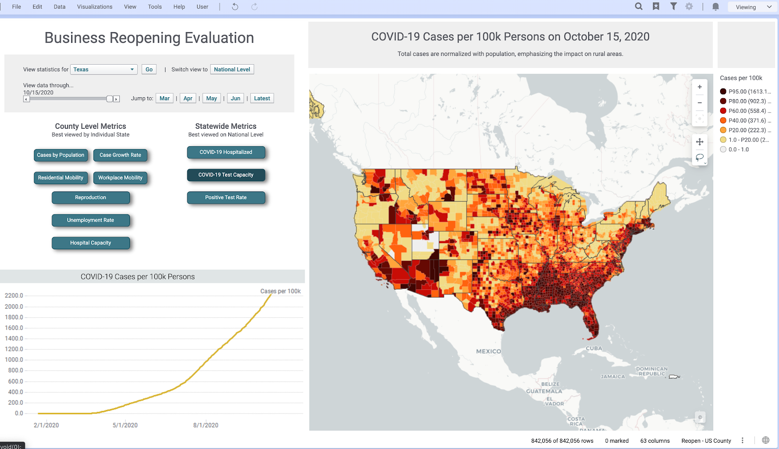
Above is a look at our ‘Business Reopening’ page. This page includes deep drills into unemployment rates, case growth, and mobility—all from different verified sources. In its many interactive features, there is the capability to switch abstraction levels from a geographical perspective, filter results by circling areas on the map, and adjust a slider to look at the analysis at different points in time. Under the hood, when these interactive elements are invoked, the command is sent to a Spotfire data function, which recomputes the analysis and sends the results back to the now updated visualizations.
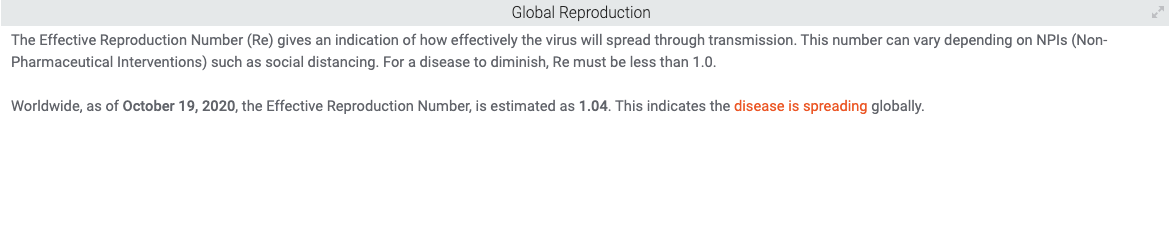
Here are some examples of different county level metrics we have in the page. All of these can be drilled down into a specific state or at the national level and have detailed views for both:

Reproduction estimates at the County Level

Workplace Mobility in different counties in the State of Virginia
Natural-Language Generation (NLG):
To make the COVID-19 Hub more accessible and understandable for any type of user, we utilize Arria’s NLG (natural-language generation) tools across our application. NLG augments the analysis by building a narrative that is not just charts and graphs, but instead generates detailed insight into what is happening through language.
By gathering information from the data, the NLG tool is able to produce sentences that summarize the data, and do so without making the text sound like it came from a robot. In an excerpt from TIBCO’s website, Arria NLG is described, “Through algorithms and modeling, Arria software replicates the human process of expertly analyzing and communicating data insights—dynamically turning data into written or spoken narrative—at machine speed and massive scale.” The NLG tool is available as a visualization type within Spotfire.
Newspaper style:
The COVID-19 Application uses what is called a Newspaper style layout for visualization within Spotfire. This layout helps in overcoming limitations that can come from a fixed length layout. For example, if a page of an application is non-scrollable, it doesn’t allow you to add as many charts and visualizations as you might want. Instead, you are limited to charts that would be visible to the naked eye and that could fit into the size of a page. The Newspaper style format in Spotfire benefits in making it possible to add as many visualizations as you want and present a logical flow of information that can enrich your insights.
You can easily configure Spotfire’s Page Layout options to extend the page length to make your dashboard newspaper style and take advantage of all the real estate that you can get. This is done by right-clicking on the page navigation bar and configuring the Page Layout to your desire (video tutorial). Here is a quick GIF of how we use newspaper style formats in the COVID-19 Application:

Summary and Future Work
There are many dimensions needed to understand an issue as complex as the coronavirus pandemic. From analyzing hospitalization data to visualizing epidemic curves, TIBCO’s Visual Analysis Hub converges data science, data visualization, and data engineering in one central application. Utilizing Spotfire, these disciplines are used in harmony to deliver insights about the state of the pandemic to just about any type of user. We hope that you were able to learn a bit more about the statistical and technical work that went into our Visual Analysis Hub.
This blog will serve as the central location for any more blogs/updates regarding the development of our COVID dashboard, so be sure to come back and read more about the work that we have done!
Here, again, are the links to the topic-focused blogs:
Estimating COVID-19 Trends using GAMLSS
Nearcasting: Comparison of COVID-19 Projection Methods
Acknowledgments & References:
Thank you to everyone who has contributed to the COVID Visual Analytics Hub and, in particular, a shout out to David Katz, Prem Shah, Neil Kanungo, Zongyuan Chen, Michael O’Connell, and Steven Hillion for their contributions towards creating these blogs and analyses.
References:
TIBCO. Arria NLG
Wikipedia. Local regression
Friedman, J. H. A variable span scatterplot smoother. 1984.