While data visualisation has been used to gain insights into medical data for over 150 years, modern methods including interactive and animated visualisations, and the development of open source programming tools are expanding what is possible.
This online event will provide a practical introduction to modern methods of data visualisation, including presentations from some well-known and influential speakers in part 1 and practical hands-on workshop exercises in part 2.
It will be held on two successive Fridays: September 17, 2021 and September 24, 2021.
R4HR, formerly known as the Club de R para RRHH, is a Latin American based community whose mission is to spread the adoption of R in Human Relations (HR), trying to make it as simple and engaging as possible, and most importantly, in Spanish, our own language.
This post is contributed by Sergio Garcia Mora. Sergio is an “HR NeRd” with a bachelor in Labour Relations UBA with a postgraduate course on Data Science applied to Social Sciences UNSAM. Sergio is the founder of R4HR and Data 4HR, and works as a SME of People Analytics at Data IQ. He is a People Analytics teacher at ITBA and is soon to become a Data Carpentry Certified Instructor.
From Sergio: “A fact about me: Data shows that I have a lot in common with Keanu Reeves.”
My relationship with R hasn’t been linear. As a matter of fact, one of the reasons why I chose to study Labor Relations is that it’s a numbers-free career as a career that has not many subjects related to maths, algebra and those kind of subjects (I like to joke that Labor Relations is like Human Resources but more hippie). Life is funny because nowadays I’m known in the People Analytics field in Argentina.
My first contact with R was in 2016 when I joined the Data Mining Master Course of the University of Buenos Aires, where R was the go-to language for most of my peers. As someone that didn’t have a background in coding or in computer science I struggled a lot trying to keep pace with my peers. Then I started to develop an entrepreneurial project and decided to delegate all the coding and technical job to my partner and I will focus more on the functional aspects of the job. So for a couple of years I didn’t write any line of code at all.
Late in 2019 I joined a BI company in Buenos Aires, called Data IQ, with such a stimulating environment, with great people, excellent professionals and a challenging environment. So, after a couple of months I started to think what can I give that was different and fresh for my team, apart from my knowledge in HR and People Analytics. So like the natural career path for BI developers is to grow towards Data Science, I thought it would be a good idea to try to learn R and bring that knowledge to the table. And it ended up not only being a good idea, but a great one.
I chose to learn R first because the code syntax is more straightforward to understand for me. And also the R community is simply awesome, specially the Latin American chapters from Argentina to Mexico, they all are very supportive and inclusive, and they all create safe and welcoming environments.
So there I was again, my R script and me face to face. Even though I can speak English and I’m comfortable with reading in this language, not everyone in Latin America is this lucky. And the other barrier I had to struggle with was the technical jargon. There a a lot of free resources but most of them are aimed at highly technical people, or to an academic audience. And the third problem I had was finding HR data. So my problems were dealing with a language that wasn’t my own, with a jargon that I don’t understand, and with data that doesn’t make sense to me.
So in May 2020 the Club de R para RRHH was born. I always remember Richard Feyman’s quote “The best way to learn something is to teach it” so that was one of my drivers.
R4HR is a project that was born in the pandemics, and thanks to it, I still can’t believe the reach we have. In our community you can find people from Argentina, Chile, Peru, Uruguay, Paraguay, Panama, USA, Spain and even France and with so many different backgrounds, HR, Psychology, Economics, Statistics, and many more.
During most of 2020 we ran our sessions on a weekly basis. And we used to charge a fee to be part of it.First because I used to think that people wouldn’’t value free stuff, and secondly, once a month we used to invite a R expert to teach us something, so we payed them for their time.
We were fortunate enough to have people like Pablo Tiscornia, Pablo Casas, Ana Laura Diedrichs, Hernán Escudero, Angie Scetta, and Paola Corrales sharing content about survey analysis, exploratory data analysis, git, Shiny, geospatial analysis, and publishing your analysis from RMarkdown to blogdown. So, our Google Drive is being filled with such priceless content.
And the community started to develop in such an organic and genuine way that still amazes me, so then it was when we decided to open all our content, and embrace the same values of the R community: openness, solidarity, safety, and high end content in an inclusive environment. And late in 2020 all of our content and our meetups are free.
So, we have content in our own language, with a jargon adapted to our backgrounds and practices, but we still lack data. So, inspired on an open salary survey developed a tech-community, SysArmy, we launched in October our first HR Salary KIWI Survey for Latam (KIWI stands for Key Investigation of Wages and Incomes after joking about ridiculous perks sometimes we see in job postings), and we have run the analysis on our own that everyone can see online and the data is available who anyone that wants to use it.
Nowadays we try to gather on a monthly basis, more people have embarked in the organizing team, and it’s so great to see the impact it has in some people, from welcome anyone and become part of the group, people finding new and better jobs, and making friends in places where nobody would have ever expected.
It’s been one of the most amazing journeys I’ve been to. And now being part of the R Consortium is such a satisfying milestone for our young community.
R Consortium talks to Laura Swales of the London R User Group on how they are dealing with COVID and changing some of the basics of their meeting. As they enter the end of the lockdown, they hope to maintain the ties online while allowing the casual networking that made the meetups inviting in the first place.
RC: What is the R community like in London?
LS: I have been involved with the R community for 4 years. The company I work for, Mango, runs events so my background is more in marketing and events. That being said, it is so refreshing to have a community that cares, is engaging, and enthusiastic about its field. This is odd in most industries. It is a welcoming field – they don’t make me feel weird for not knowing R or data science. If I want to know something, I don’t feel out of place to ask and they answer my questions, which is nice! There is no gatekeeping and people don’t come in with an elitist attitude. Usually, people would come in person, have a drink, and find out what others are doing. It’s a great environment to be in. It is nice that my job itself is to help build the community. I think I am one of the few people who do this as part of their job, Rachel Dempsey at R Studio also has a similar role, and it has been great to talk to her about managing communities.
RC: How has COVID affected your ability to connect with members?
LS: The biggest thing that has been affected is the missed opportunities to chat in a relaxed environment. This was one of our big draws, and it’s the hardest thing to replicate online. It is really hard to do casual networking in an online setting. We can do content talks and workshops, but it’s been a real challenge to do networking. I’ve seen people use different ways, but it’s really difficult to do.
RC: In the past year, did you have to change your techniques to connect and collaborate with members? For example, did you use GitHub, video conferencing, online discussion groups more? Can these techniques be used to make your group more inclusive to people that are unable to attend physical events in the future?
LS: We started with Zoom with the account from work since people were used to that. We ended up moving to BigMarker to improve the process for attendees. We found that zoom had issues, with an extra step to add to people’s calendars. With BigMarker, people were able to automatically add the event to their calendar. It also has a lot of built-in features that allow for better communication. We have used hopin before, but BigMarker seems to be working better.
RC: Can you tell us about one recent presentation or speaker that was especially interesting and what was the topic and why was it so interesting?
LS: Robert Hickman did a talk on Amateur and Professional Analytics of Football (soccer) using R. I’m not a data scientist, so this talk was more tangible because it’s something that I can comprehend!Football is something I know even if I’m not a big fan. The attendees had a lot of good questions – for example ‘How did he get the data, is it comparable to other sports’, and more.
RC: What trends do you see in R language affecting your organization over the next year?
LS: I spoke to the members about this and they said that the surge in the tidy model ecosystem is going to be a big one. I also heard about the increased focus on auto-testing. Finally, the process framework for writing better code for the community will be big.
RC: Do you know of any data journalism efforts by your members? If not, are there particular data journalism projects that you’ve seen in the last year that you feel had a positive impact on society?
LS: The people from the NHS R Community are doing great work. They are doing some interesting things and we are going to be involved in their conference in November. Their work is in the real world since they are working with Health Analytics. They have a lot of content on the stats of COVID, and their project and works are impacting the UK.
RC: When is your next event? Please give details!
LS: We tend to have fewer events online due to conflicts with people’s schedules. How we tend to run them is one month we would run a workshop and then the next month a presentation. Normally, in a world without COVID, we would run late into the evening. However, since people are at home and have scheduling conflicts at home, our events are running shorter. Because of that, we have tried to set them up earlier in the evening. We currently don’t have anything scheduled right now. However, something that I’ve noticed is that with online events we don’t need to have a lot of lead time. I asked members if they would be interested in an in-person meetup and have gotten a positive response. I hope to have an online event maybe in July and hopefully an in-person in September or October. For the in-person, we may be able to have a live stream on twitch depending on the internet at the venue.
LS: Consolidating R Ladies global. A lot of my colleagues have come from R Ladies and it’s been great to see it grow and become an important part of the community and be so welcoming. They are not afraid to stand up for what they believe in. They also make R an accessible place to be. They don’t judge your background, as long as you are there.
LS: R pharma is my favorite. It has been interesting to see how the pharma industry is working. Despite the setup of the companies (with NDA agreements), they are open to sharing how they are doing, being collaborative even within their work. It is refreshing to see.
RC: There are four projects that are R Consortium Top Level Projects. If you could add another project to this list for guaranteed funding for 3 years and a voting seat on the ISC, which project would you add?
LS: Accessibility within R would be a great thing to look at. It is always important to allow equal access to people, and can only be a good thing that expands access to other groups.
How do I Join?
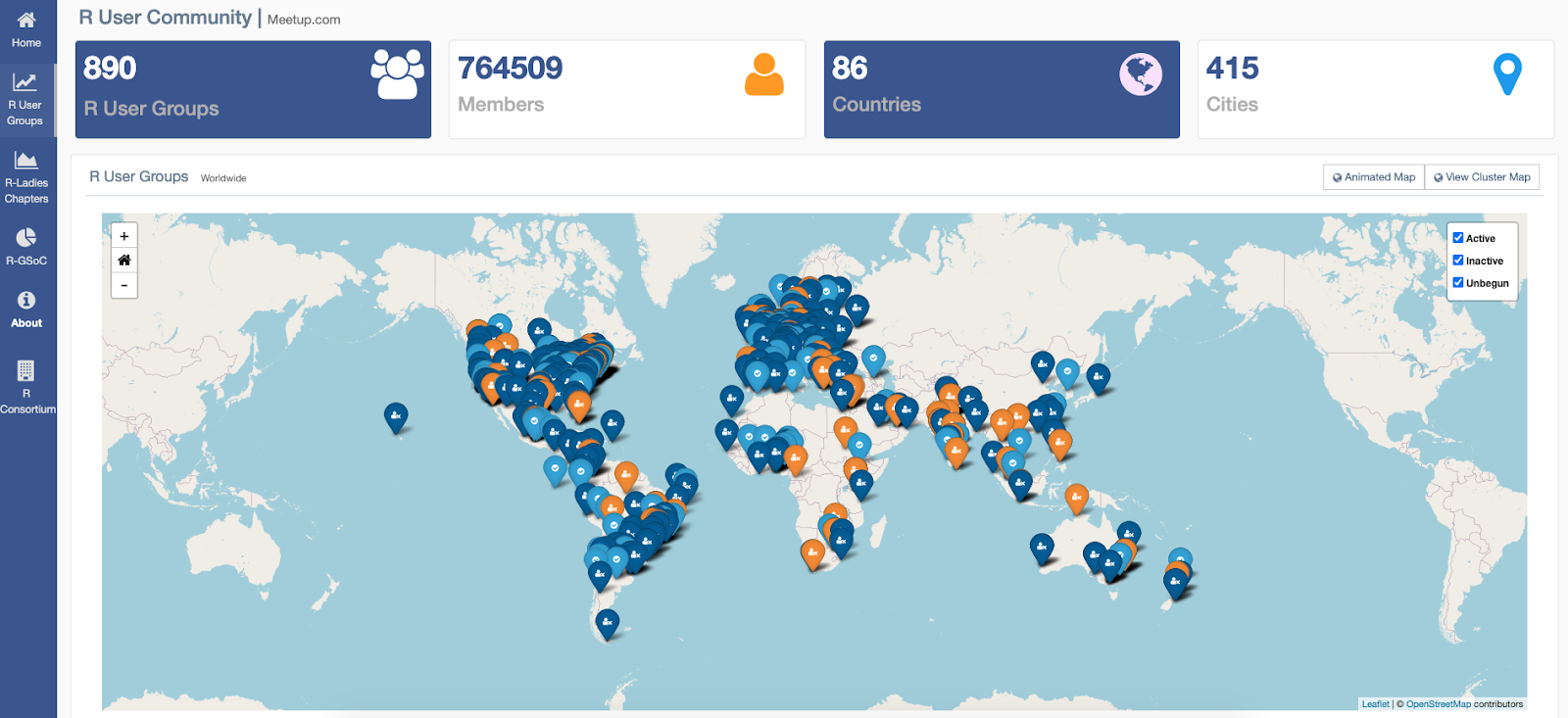
R Consortium’s R User Group and Small Conference Support Program (RUGS) provides grants to help R groups around the world organize, share information and support each other. We have given grants over the past 4 years, encompassing over 65,000 members in 35 countries. We would like to include you! Cash grants and meetup.com accounts are awarded based on the intended use of the funds and the amount of money available to distribute. We are now accepting applications!
R consortium fulfills a unique need in the growing data science space. Also, R language resources are critical tools in the data-driven economy. The R ecosystem productizes openly developed technology into commercial products and solutions. Businesses sustain the virtual cycle by reinvesting profits into the project and technical community.
R consortium sits under the umbrella of the Linux Foundation. R consortium is here to support the R community to promote, develop and extend the reach of R. The R Consortium’s open-source governance and foundation model has been uniquely positioned to benefit the worldwide community of users, maintainers, and software developers. You will be able to find out about the who, the what and the why around R-consortium
You will also learn about:
How R Consortium connects the dots within the R community & promotes collaboration
R Consortium mission and vision
R Consortium Membership
The impact of R Consortium
Projects with sustainable ecosystems matter
R Consortium Funded Activities and Projects
Working Groups drive industry engagement
How can you get involved?
Bottom line is, R Consortium welcomes members from all types of organizations!
From the useR! 2021 conference
Also, I wanted to share my experience at the recent useR! 2021 conference. The keynote presentations from July 5- 9 conference were very interesting. Below are some my key takeaways:
1. R Spatial analysis
R Spatial is a lively community of people using R for analyzing spatial data. Things took off from 2005 on when packages like sp, rgdal, rgeos and raster provided shareable infrastructure for spatial vector and raster data. R Spatial has constantly relied on the OSGEO libraries GDAL, PROJ and GEOS for I/O, coordinate transformations, and geometrical operations. Upcoming changes for R Spatial include switching to spherical geometry, handling of data cubes, and time-dependent coordinate reference systems that cope with plate tectonics.
Speaker: Professor Edzer Pebesma at the Institute for Geoinformatics of the University of Münster.
2. Tools and technologies for supporting algorithm fairness and inclusion
Graphic representations created by R are easily understood by people with no background in statistics, which makes it a great tool for advancing public policy and the Sustainable Development Goals.
“Inyathi ibuzwa kwabaphambili” is a Xhosa proverb, which means wisdom is learned or sought from the elders, or those ahead in the journey. In this multi-contribution keynote, we will hear from those ahead in the journey – Dorothy Gordon, Achim Zeileis, Kristian Lum and Jonathan Godfrey.
Dorothy Gordon, chair of the UNESCO Information For All Program, talked about making technology accessible particularly to women and Africans, and how utilizing tools such as R can help advance public policy. Achim Zeileis, Professor of Statistics, University of Innsbruck, Austria, will discuss making the color schemes in data visualizations accessible for as many users as possible.
Speakers: Achim Zeileis; Dorothy Gordon; Kristian Lum; Jonat Godfrey
3. Can we do this in R? – Answering questions about air quality one code at a time
Every time we encounter a large dataset, a new modelling approach, a new statistical technique, a new visualization challenge, we ask ourselves: “Can we do this in R?” and for the past four years (since we started this work), the answer has been a resounding “yes.”
Speaker: Meenakshi Kushwaha, Co-Founder and Director of Research, ILK Labs, Bangalore
4. Teaching how to teach without leaving anyone behind
Metadocencia was born in March 2020 when the pandemic forced us to change the way we teach and learn. We began by running a workshop with evidence-based educational methods that could be applied in a simple way. We also provided open resources to encourage effective teaching practices and invited people to share their experiences and form a community. A year later, we opened 3 new workshops and reached more than 1500 people in 30 countries.
Speakers: Paola Corrales; Elio Campitelli; Ivan Poggio
5. Expanding the Vocabulary of R Graphics
R Graphics system defines a graphics vocabulary for R – a set of possible graphics operations like drawing a line, coloring in a polygon or setting a clipping region. This talk will describe work on the graphics engine that expands its vocabulary to include gradient fills, pattern fills, clipping paths, and masks.
Speaker: Paul Murrell, Department of Statistics, The University of Auckland
6. Research software engineers and academia
Nearly all research relies on research software, yet we are still lacking adequate acknowledgment and career paths for RSEs. I want to discuss the status quo and future of software in research, the role of the R community, and what it has to do with my personal path.
Speaker: Heidi Seibold, Group lead of the Open AI in Health group at Helmholtz AI
7. The R-universe project
R-universe is a new platform by rOpenSci under which we experiment with various ideas for improving publication and discovery of research software in R. The system automatically tracks upstream git package repositories, builds binary packages for Windows and Mac, renders vignettes, and makes data available.
Speaker: Jeroen Ooms, Staff research engineer at UC Berkeley
8. Communication – elevating data analysis to make a real impact
Data analysis is key to identify patterns, understand processes and guide effective policy-making to solve real world problems. Data journalist Catherine Gicheru and atmospheric scientist Katherine Hayhoe will share their work and experience communicating key data results to the general public and stakeholders.
Speakers: Catherine Gicheru; Katherine Hayhoe
Please connect with us using any of the below methods
R Consortium talks to Yanina Bellini Saibene, Riva Quiroga, and Natalia da Silva on starting up a conference in Latin America, the importance of networking, and some of the difficulties that some people have in different parts of the world.
RC: What is the R community like in LatinR?
NDS: We are growing fast. Under new initiatives, we have grown to over 45 R-Ladies chapters in Latin America. We are now having conferences in Latin America like LatinR, SER in Brazil, and more.
RQ: Many people thought they were all alone. LatinR and different conferences have shown that the groups are connected. We met online without meeting in person. This was possible because we had connections through R-Ladies. This allows those connections to become visible, both in communities and in a broad region. It is growing very fast. For many people, LatinR was their first contact with the R community, and from there they created RUG in their community or started projects.
NDS: The first LatinR was in 2018 in Buenos Aires in 2019 was in Chile. We hope to have 2020 in Montevideo but were unable to due to COVID. We ended up doing so virtually.
RC: How has COVID affected your ability to connect with members?
NDS: The pandemic situation has made it very difficult. LatinR is done with volunteering, and everyone had a lot of things going on. It was difficult to find time to organize a conference in this situation but we did it. In the end, we had a great conference and we got more people involved in the R community.
RQ: I think another problem has to do with sponsors. If you are organizing an in-person conference, sponsors get something. They have a space for giving away swag or give a talk, so they can feel the people are getting something for their money. And that is not as easy in a virtual event. It’s not as easy.
NDS: Not just not easy, it’s impossible to find one for these conferences. The only way that LatinR has survived is because of volunteering.
RQ: Because it’s virtual, we don’t want to charge people for attending the conference. So not too many institutions can give us help for organizing the conference.
YS: However, R Consortium has helped us. They let us use zoom for hosting the last three days of LatinR. It was a way to help where we didn’t have to pay for it out of our pocket.
RC: In the past year, did you have to change your techniques to connect and collaborate with members? For example, did you use GitHub, video conferencing, online discussion groups more? Can these techniques be used to make your group more inclusive to people that are unable to attend physical events in the future?
NDS: We used slack to organize the conference. We are also very active on Twitter. It’s basically for promotion and to figure out what is going on. We also have a web page that has a lot of information. We also use Github to share information from previous conferences as well as the presentations. We also have a youtube channel with different presentations. That is the way that we are organizing the materials, by combining all of these tools.
RQ: Slack is also a social space for the members to gather. It’s not only for the organizing team but also for the people who want to attend the conference as well as for people who have attended before. They can participate, ask questions, or how to prepare for R Conferences. Not just for LatinR, but other conferences like the R Studio Conference. It helps because if you want to give a talk at a conference you can go to the channel and talk to the committee and they can give you some feedback. It’s also a space that is used not just for organizing LatinR but also throughout the year. During the conference, we didn’t have a live stream, but we did have a live Q and A panel where we were able to ask questions.
RC: Can you tell us about one recent presentation or speaker that was especially interesting and what was the topic and why was it so interesting?
YS: The fact that we had the conference here and brought some rockstar names from the R community to this part of the world is another huge benefit for South America. We had Alison Presmanes Hill and Maëlle Salmon for the last conference. We had a lot more talks, about reproducibility, data science, and more. It’s all volunteer work and we are proud because it’s done by hand. The fact that these people come and see the community that comes here is amazing.
NDS: Having these people here shows that we can get anyone. Right now, with COVID it’s not quite the same. It’s a lot easier for them as well as us. But, if we can get them in person, the effect will be much bigger on the community. That would be something important for us and the community as well.
RQ: And these talks were useful given the context. Maëlle Salmon gave a talk on making your website using distill. Alison Hill gave a talk about how to learn new things and that was impactful for people who were alone in their home and didn’t have a community in real-life spaces. It was really important because it was something that impacted their lives. We have tried to invite people who will talk about things that are important for our region. For example, when Hadly Wickman we asked him to run a workshop on how to make an R package. The idea is that having more people in our region making R packages for the community. More people after the workshop sent their packages to CRAN and had their packages published. It was really interesting, because that workshop was in 2019, and last year we had people who presented packages that they produced because of the workshop. We are trying to think strategically, what people can do that will help the community and help others.
NDS: I think, overall, we had an impact on package production for the R community after this workshop.
YS: Also, the tutorials we did last year. In Buenos Aires and Chile we had tutorials. Last year we were able to have more because of the virtual part. We had the first two in Spanish and English. Last year we were able to do it in Portuguese. We were also able to have people certified as RStudio and Carpentries instructors teaching the tutorials which allow us to have nice, high-quality tutorials. This shows that people from our region can give quality training in R. We like to say that we are not just a conference, but rather a community. The conference is a way for us to see each other and show what we have been doing since the last time. What works and what doesn’t work as well as concerns in the community.
RC: What trends do you see in R language affecting your organization over the next year?
NDS: I think that R is changing and we have to pay a lot of attention. Right now, R Studio is involved in the R Community and is taking a more major role in the community. All these changes mean that we have to be kept up to date. We cannot go to sleep and think that the world has changed. We need to keep inviting people to our conference to keep our community up to date. In terms of the day, R Studio is a companion. People are also using the Tidyverse, and you have to keep learning this all the time. I think that there will be some confusion between R and R studio making sure that the programs work well together.
YS: We have a really big player in R Studio and they lead some of the changes because they make good tools. And we use that tools. But they are a company. We need to make sure that we have a strong community that can ensure that R Studio pays attention to the wants of the community. For instance, more people want better accessibility in R, so we need to make sure that R Studio works on this as well. We need to have a balance because they are using an open-source language.
NDS: Maybe we need to make sure that we are teaching in R and not just in R Studio. Because R came first and is open-sourced and no company runs it.
YS: I think that R Studio needs to be held accountable. One thing that I’m happy about is that the R Community has standards. For instance, the data camps, R-Ladies, Africa R, and others give people the space to discuss and feel safe doing so.
RQ: We have to be very careful about what we want to showcase at the conference. Right now, the pipe being in the base is the new thing. We are talking about do we want to use it, how will we do it. This is on the top of our list because there are no resources in Spanish or Portuguese to learn the pipe. Some people are blogging on it. We want to be up-to-date in R Base, Tidyverse, DataTable, etc. We want to show people a variety of ways to do something. So if you use R Base, we need to offer this. If you are involved in Tidyverse and Tidymodels, we need to offer that. If you are a Data Table user, we need to offer that as well. Offering those different ways to address the same problem. Even though there are major players that may have a way to do things simply, we have to be aware that some people may not be able to use them. This is why we need to offer a wide variety of approaches to the same problem.
RC: Do you know of any data journalism efforts by your members? If not, are there particular data journalism projects that you’ve seen in the last year that you feel had a positive impact on society?
RQ: People from Datasketch, a company from Bogota, Columbia, started making tools for data journalists for people to use without using R. They made a lot of shiny apps for people to use. If you have data you can upload the data, get a plot, and put it in your report. They are doing a lot. They ran a crowdsource a couple of years ago. They presented their shiny apps in 2019 and 2020. Mostly they are used by data journalists in Latin America. They are also organizing meetups.
YS: We also have some people from Politics who are building a package that analyzes speeches.
NDS: In this field, there are people from Argentina and Uruguay who are working on similar packages who are making packages to analyze this type of data.
RQ: We have both people doing data journalism as well as people making packages that would help people do their job.
RC: When is your next event? Please give details!
NDS: LatinR will be on November 10-12 and the previous week we will have workshops. Right now we are doing calls for papers till July 31.
RQ: People can present in Spanish, Portuguese, or English. We are very open in terms of language. We are a trilingual conference so people can present in any of those languages.
YS: R-Ladies. That’s an easy question. For me, R-Ladies changed my life. It is amazing.
RQ: Because of R-Ladies we were able to meet each other and started organizing a conference.
NDS: We exist because of R-Ladies. Without R-Ladies, LatinR would not be and we would never have met.
YS: And a lot of people from the organizing team are from R-Ladies. And a lot of the other user groups have R-Ladies members in them.
RQ: It has been easier to invite people to the conference because of the R-Ladies network. It was very difficult to ask people about a conference that has never happened before. We asked Jenny Bryan, and she said yes I think because we asked through the R-Ladies channels.
NDS: Certification would be a good one to do. TO have a common certification program would be very important. Also, this would be good for academics as well as work. Maybe if they have some sort of certification is good.
RQ: Currently, the only way to show that you know anything about R is to take the R Studio certification and pay for that. There is no way that you can prove that you know anything. Maybe your Github would be a way to show that you know something.
NDS: Maybe you can show your Github account and show people your work and what you can do.
RQ: Having an R certification would be great!
RC: There are four projects that are R Consortium Top Level Projects. If you could add another project to this list for guaranteed funding for 3 years and a voting seat on the ISC, which project would you add?
NDS: Something about diversity. The language barrier is hard. We have different barriers other than language. You have support for a conference, but it’s not the same for us in Latin America. Each country has its problems. Maybe different areas need different types of support.
YS: Yes. Something as simple as getting reimbursed is different in Latin America. It’s really hard for us. It took me 12 months to get a check for $97 for my chapter of R-Ladies. And I had to pay taxes and pay to get it. This is something that people don’t realize. This is something that you don’t know if you don’t live here. Not all countries in Latin America has post mail for instance. Some of them have a central post office where you would have to travel to receive your post, pick it up and pay for it. While other countries in the region may have it. I have to pay a notary, go through customs, and more to get a shirt that someone sent me. These are the types of issues that we deal with. If you want to help people, you need to listen to us. You need to listen to people from this region in the places where decisions make. The effort has to make by the R Consortium to make these changes. I already have to work 3 or 4 times as much. I have to learn another language, be able to understand your language, and I have to try to speak it in a way that could be understood. We cannot afford to work on the process as well. A way to streamline support will help us immensely.
How do I Join?
R Consortium’s R User Group and Small Conference Support Program (RUGS) provides grants to help R groups around the world organize, share information and support each other. We have given grants over the past 4 years, encompassing over 65,000 members in 35 countries. We would like to include you! Cash grants and meetup.com accounts are awarded based on the intended use of the funds and the amount of money available to distribute. We are now accepting applications!
R Consortium talks to Daniela Vázquez of R Ladies Montevideo on how they are building community in Latin America and trying to host a conference that people would attend. The initiatives they have done are helping create a sense of community and encourage people from different places to attend conferences together.
RC: What is the R community like in Latin America?
Our community is mostly Spanish speakers, but we also have English and Portuguese members. We have guests, especially keynote speakers, that only speak in English, but most of the talks are in Spanish. We would have rooms for related fields in different languages. The main talks were then translated into different languages. Because most conferences are in the Northern Hemisphere, we tried to have a great quality conference of the same quality as those up north but without the traveling. The idea is to foster community by having a conference where people are close to each other. We also translated the R for the data science book. We are in a space where we have a community and we share similar idiosyncrasies. When we attend a conference in the Northern Hemisphere, we have the same baseline of interests and act the same.
RC: How has COVID affected your ability to connect with members?
We were pretty active before COVID. In Montevideo, we didn’t have a mandatory lockdown. Luckily, both LatinR and our local R Ladies groups were able to stay active while socially distant. The organizers tend to be very busy, so we don’t meet in person as much. I haven’t even seen my mother except over the fence. We had to stop because we didn’t have time. In the little time we did have, we had to work. I’m a consultant myself, so my work time was very erratic. It was crazy. Everyone was having the same difficulties.
That was one thing, but the other thing was that you felt that we were all together. We were all in the R Ladies Group, and we were meeting regularly and had good communication. Others were not so talkative and were muted with cameras off. We did most of the talks because we did the introductions for the speakers. It was hard for us because it was difficult to build something where people felt comfortable talking. When you have 20 boxes where people are just looking at you, it can be very daunting. We did reach more people because you didn’t have to be in the city – which was good. The bad part was that you didn’t know the people because they were from different countries. On the one hand, it was good that you could take advantage of this. On the other, the people who always came to the meetups didn’t know any of the new people so they were more withdrawn and didn’t interact.
One added benefit was that we were able to invite and bring in speakers from far away. We were able to invite María Teresa Ortíz to talk about geospatial data, which we have never done before so that was good.
RC: In the past year, did you have to change your techniques to connect and collaborate with members? For example, did you use GitHub, video conferencing, online discussion groups more? Can these techniques be used to make your group more inclusive to people that are unable to attend physical events in the future?
We have tried a Slack channel where we were encouraging people to join, but we had very little interaction there. This may be a cultural thing. I was a founder of the Buenos Aires chapter, and everyone talked on the Slack channel there. But, here it is the exact opposite. We were unable to take these relationships and make them digital. We would talk about one specific project and come up with a solution in person. We haven’t tried doing this online. We also didn’t know about meetup. People just joined so they knew when the meetings were. It was just popular for people working in the software industry but not for others. Most of our community is academics. It wasn’t easy but we are making progress. Most people are on Twitter so we are using that now. We have a repo where we put the presentation and the materials so that others can review it if they miss the meeting.
RC: Can you tell us about one recent presentation or speaker that was especially interesting and what was the topic and why was it so interesting?
We only had one speaker this year, Teresa. She gave a talk on geospatial data. We had a lot of interest in that presentation. It was great, because it was a subject that not many people knew how to use, and it was a way to facilitate many different topics for our members. She was great. It was great we were able to bring her on virtually, due to the pandemic. We are contacting two more speakers to talk about things that we don’t have locally.
RC: What trends do you see in R language affecting your organization over the next year?
One of the biggest issues that our members have is reproducibility. This is mostly because our members work in academia. They need to be sure that the results can be independently reproduced.
RC: Do you know of any data journalism efforts by your members? If not, are there particular data journalism projects that you’ve seen in the last year that you feel had a positive impact on society?
I love data journalism and it started to be a thing a few years ago. We have a newspaper that works with people who are specialists, like water, and lets them work in their field. They are trying to do things with data, and they are gradually acquiring the skills. That is something that people are improving on.
We also have an initiative called ILDA (Latin American Initiative for Open Data). They are conducting research based on femicide, among other things. Here, it is hard for a homicide to be cataloged as femicide, and they are trying to make the statistics comparable between Latin American countries because all countries have different ways to catalog those. I think they are trying to do some data journalism on that. I don’t know if they are doing any other topics, but they are trying on this front now.
RC: When is your next event? Please give details!
We are planning on having a new event by the end of June. Probably about reproducibility, but we still need to clarify and find the details. It’s not written in stone, and we have to book our slot on R Ladies Zoom.
I had to read about that because I wasn’t aware of all the initiatives. I’ve seen tweets about some of them, but I’ve not checked them on Twitter. I like R Ladies Global, which I think is crucial because, when we have an R User Group we feel that women feel more comfortable being around other women and ask more questions. It’s been key for the R-ladies to go to LatinR. Natalia was very interested in the visualization project because she works with that topic. I wasn’t aware of all the things that you do, but it’s awesome!
I was interested personally in R Certification. I think it’s pretty cool and would love to have that available. It was something that I was looking at before.
How do I Join?
R Consortium’s R User Group and Small Conference Support Program (RUGS) provides grants to help R groups around the world organize, share information and support each other. We have given grants over the past 4 years, encompassing over 65,000 members in 35 countries. We would like to include you! Cash grants and meetup.com accounts are awarded based on the intended use of the funds and the amount of money available to distribute. We are now accepting applications!
By Samantha Toet, Derrick Kearney, Sydeaka Watson, Gwynn Sturdevant, Kevin O’Brien, and Joe Rickert
We’re trying something new and we want your support.
One of the goals of the R-Consortium Diversity and Inclusion project is for R Consortium-affiliated events to be more representative of the wider R community. As a result, we put together a community form for you to nominate your peers to speak at upcoming R Community events. This is a great way to promote the work that your colleagues are doing, and draw speakers from varying levels of expertise.
We are working with several R-related conferences and events that are seeking recommendations for knowledgeable and engaging speakers on topics that are of interest to the R Community. Our aim is to encourage speakers from diverse backgrounds to consider speaking at R events, and we would like to build a platform to bring these potential speakers to the attention of conference program committees.
About the R-Consortium R Community Diversity & Inclusion Project
The goal of the R Community Diversity and Inclusion Project (RCDI) is to broadly consider how the R Consortium can best encourage and support diversity and inclusion across a variety of events and platforms. Anyone is welcome to join our team, and you can find more information about joining here: https://github.com/RConsortium/RCDI-WG
Stephan Kadauke, MD, PhD, is an Assistant Professor of Clinical Pathology and Lab Medicine. He runs the Cell and Gene Therapy Lab at the Children’s Hospital of Philadelphia (CHOP) and also sees patients on the Apheresis service. As the Lead of the Cell and Gene Therapy Data Operations team, he has implemented several apps that are being used internally for clinical operations. He co-founded the CHOP R User Group, and he is the chair of the R/Medicine Organizing Committee.
R Consortium talks to Stephan Kadauke on the topic of Racial bias in algorithms. We also talk about how an overarching collaboration of R/Medicine and R in Pharma may help solve some difficult problems facing those in healthcare who use the R ecosystem.
RC: What is the R community like for R/Medicine?
The odd thing is that we are not all R programmers and we are not all health care professionals. After the R/Medicine 2020 conference, we looked at the demographics of our attendees and found out that 16% were practicing physicians. So a large contingent of our community actually takes care of patients. It’s also pretty international! Because of COVID, we switched from in-person to virtual in 2020. The previous two years, we had the R/Medicine conference at Yale (in New Haven, CT), then in Boston. We had about 100 people attend both of these. In 2020 we went virtual and grew five-fold, had participants from 43 different countries, and 1/3 of attendees were international. R/Medicine went global.
RC: How has COVID affected your ability to connect with members?
Things have changed and for better or worse they aren’t going back. We can’t have an exclusively US-centric conference anymore. I missed the interpersonal connections of a real live in-person event, and we did have virtual Birds-of-a-Feather sessions in Zoom breakout rooms, but there is only so much you can do to try to replicate the in-person experience. For our next event, we plan on using a platform that helps with these interactions, but nothing approximates the in-person experience. Of course, we don’t want to do this in a way that loses the virtual experience or the global community. This is a very difficult situation and one we haven’t resolved. Once the COVID pandemic is history, it would be really cool to do a hybrid-distributive conference where there are lots of small watch parties in various places to have a virtual and in-person event globally. I don’t know if we will pull it off but that would be awesome.
RC: In the past year, did you have to change your techniques to connect and collaborate with members? For example, did you use GitHub, video conferencing, online discussion groups more? Can these techniques be used to make your group more inclusive to people that are unable to attend physical events in the future?
For R/Medicine 2020 we used Crowdcast. I think Crowdcast is awesome. Compared to some other programs, Crowdcast is more limited because you don’t have an exhibit hall, multitrack, poster board, and those types of things. Instead, everyone is dropped into a single track video stream with a chat window on the side. By removing degrees of freedom there’s fewer user experience possibilities to consider for the org committee, and it also tends to lead to a more cohesive feeling for the participants. I was a big fan of using Crowdcast and we will use it again this year. For the Birds-of-a-Feather sessions, we used Zoom, which worked OK. For 2021, we’re looking into an alternative platform that does a better job allowing the kinds of chance or planned encounters and interactions that happen at a real live conference. Behind the scenes communication is super important too. We used a closed Slack channel, which was efficient for conference planning and putting out fires when necessary. Much of the planning relied on Google Docs. This stack I think is pretty common in planning online conferences these days.
RC: Can you tell us about one recent presentation or speaker that was especially interesting and what was the topic and why was it so interesting?
Racial bias in medicine is such an important issue, especially when you’re using the electronic health record to feed predictive models that will have some kind of downstream effect on patient care. Both of our keynotes for R/Medicine 2021 will discuss this topic. There’s a paper in Science that looked at a widely used algorithm that is supposed to identify patients who are at high risk for disease and need extra care. They found that the algorithm disproportionately selects White patients for extra help, and if you’re Black you’re on average much sicker to be selected. This is because the algorithm used health costs as a proxy for health needs, and because less money is spent on Black patients, it falsely concludes that Black patients are healthier than equally sick White patients. This is insane, and probably just the tip of the iceberg. But algorithmic equity really is a hard problem! For example, do you want your algorithm to consider a person’s race or not? It may seem to make sense that you want it to be color-blind, but then you can’t correct for biases embedded in the training data. Another issue is the trade-off between accuracy and fairness. Predictive algorithms nowadays exclusively optimize for predictive accuracy. How can we make them consider measures of fairness? This is something that Michael Kearns discusses in his book The Ethical Algorithm but something that we aren’t talking about in mainstream AI yet. You can mathematically define equity, and you can design your algorithm so it optimizes for a specific trade-off between accuracy and equity. We need to talk about this. I want people to get more fired up about this. I think the R community is one of the wokest communities. We should be the leaders in ethical AI! When will tidymodels support socially aware modeling? There are so many fields where algorithmic bias can screw with people’s lives. Cathy O’Neil did an awesome job capturing this in her book Weapons of Math Destruction, which is both amazing and depressing at the same time… to see where machine learning algorithms are systematically discriminating against minorities in law enforcement, lending, and health care. Especially in health care where we “first do no harm”!
RC: What trends do you see in R language affecting your organization over the next year?
How do you put R into production? How do you make clinical-grade R applications? There are some major efforts trying to establish standards and guidelines, both for software engineering and validation, and this will really help, but as of yet there isn’t a consensus. This year, we are trying to gather ideas from people in the field who are thinking about this professionally. We’re planning to have a fireside chat with folks who have made R based applications that undergo regulatory scrutiny and folks who made frameworks for production-grade Shiny apps. Hopefully, eventually we’ll be able to offer a workshop to package some of these best practices into a teachable format. We hope this will lower the bar for creating good clinical software.
RC: When is your next event? Please give details!
R/Medicine 2021 will be held August 24-27. The org committee is working full steam on the program and logistics as we speak. R consortium is helping tons with that as well as the Linux Foundation. We will have two days of workshops and two days of presentations. This will be all virtual. Registration is open now, and it’s all-inclusive, with all workshops and videos, for $50. If you are an Academic it will be $25. All students and trainees can attend for $10. If this price point presents a financial hardship, we can talk about that as well. We are trying our best to keep the barrier low for attending. I’m biased, of course, but I think it’ll be an awesome event – we have some great workshops, keynotes, and sessions lined up!
I’m a big fan of R Validation Hub! Validation is really important when it comes to clinical software – you really have to be able to show, to a reasonable degree, that what you think your software does is what it actually does. Another important part is software engineering for reliability, scale, and usability. When we think about best practices, we think about software engineering as well as validation, and how we bring those together is an important question.
I am a big fan of R in Pharma. The R in Pharma conference last year was amazing and had tons of great workshops and speakers. Thematically, R/Medicine is really well aligned with R Pharma. Of course not all of medicine is pharma, and arguably not all of pharma is medicine, but we do have a lot of overlap.
RC: There are four projects that are R Consortium Top Level Projects. If you could add another project to this list for guaranteed funding for 3 years and a voting seat on the ISC, which project would you add?
I would love to have an “R in Healthcare” project and working group to capture some of the synergies between the R/Medicine and R in Pharma communities. This working group could hammer out some of the issues that are shared between pharma and medicine, which includes the question of how to build R based apps that can withstand regulatory scrutiny as well as some of the important societal issues with algorithmic bias that we talked about earlier. I think the funding could also go to fill some of the gaps in the R ecosystem that healthcare researchers face – for example, building CONSORT diagrams with ggplot2, or creating a high-level functionality to de-identify sensitive microdata. It would be great to have R Consortium funding for one or two engineers building open-source solutions here.
How do I Join?
R Consortium’s R User Group and Small Conference Support Program (RUGS) provides grants to help R groups around the world organize, share information and support each other. We have given grants over the past 4 years, encompassing over 65,000 members in 35 countries. We would like to include you! Cash grants and meetup.com accounts are awarded based on the intended use of the funds and the amount of money available to distribute. We are now accepting applications!
During this Working with Databases in R online presentation, Christopher Maronga shares his years of practical experience in accessing and working with Databases in R. R Consortium assisted by providing access to Meetup.com Pro as a platform for information sharing
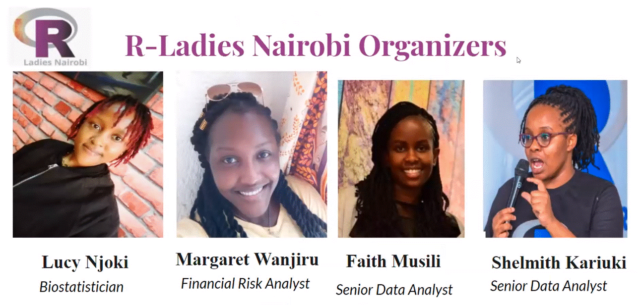
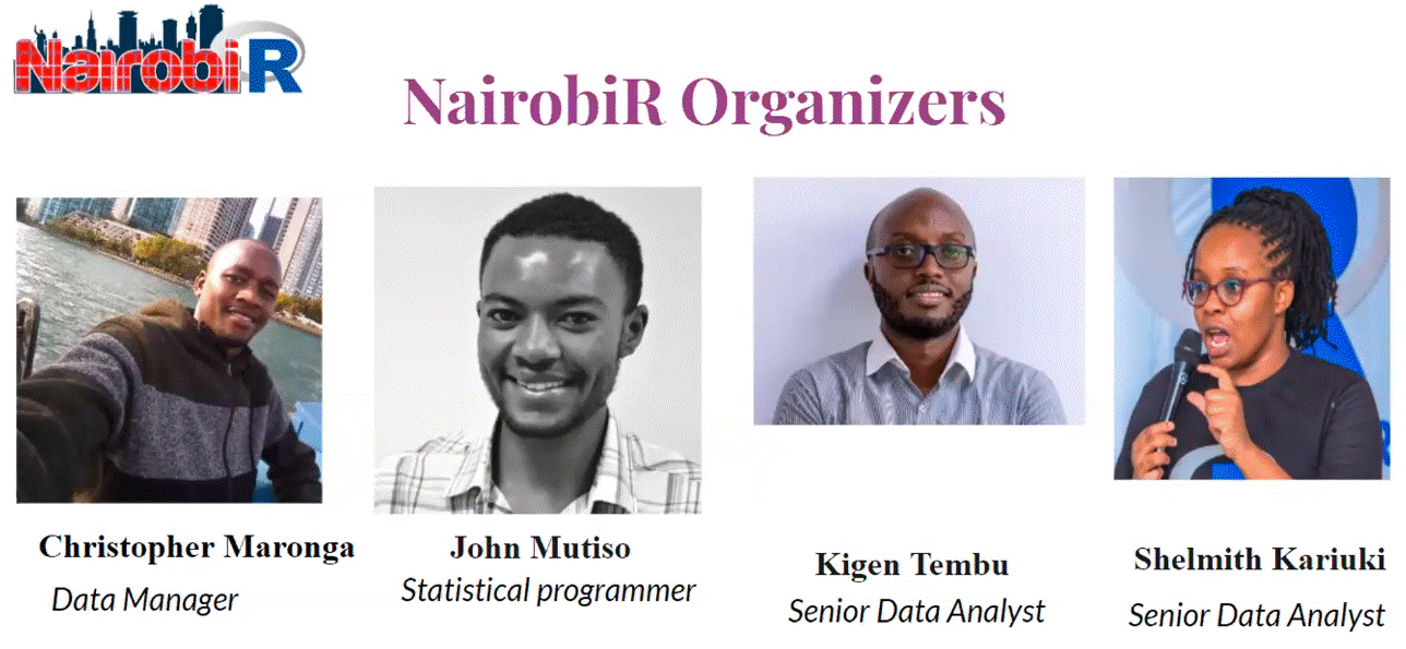
John Mutiso, a statistician and member of Nairobi R, introduces the presentation on Working with Databases in R and points to the support of the R-Ladies Nairobi Organizers and NairobiR Organizers.
Christopher Maronga, a data manager, then shares his practically gained experience on how we can turn R into a powerful tool for accessing MySQL databases and writing SQL code, pulling and querying data from within the R environment.
Maronga structured this session to be mainly hands-on learning by using coding examples and implementations. In his presentation he teaches how to efficiently connect R to RDBMS, query data stored in the RDBMS via R, connect and export data from REDCap and API security. He introduces what RDBMS is and how it is used for storage and management of data. He then goes on to explain REDCap and how it is a secure web application for building and maintaining online surveys and databases. Maronga then jumps into practical examples illustrated through the use of a local SQL database.
In the concluding section, it is emphasized that just knowing how to get data into R efficiently is half the battle in the path towards using R in data science. The speaker ended the session on the note that we should expect to see many more collaborations between R-Ladies Nairobi Organizers and NairobiR Organizers in the future.
The R Conference has been able to thrive with the changes that have occurred due to COVID. They also are planning for life post-COVID, with the lessons that they have learned from a digital world working their way into how they organize conferences going forward. R Consortium talked to Jared Lander about the issues with online conferences, how they have seen increased attendance, and how they will incorporate them into a new hybrid system.
RC: What is the R community like at the R conferences in New York and DC?
Each conference is a microcosm of the area that they are located in. We see all fields at the conference since all groups come together.
For the New York conference, it’s mostly people from the metro area, but since New York City is a hub people will stop by and attend. People are always visiting beyond the geographic area. People from Europe come and talk. We get a lot of people we wouldn’t otherwise because it’s a hub.
The DC conference is a government conference. It’s a way to focus on the DC community and their interests. It focuses on government and public life. Military talking about military matters. Intelligence offers to talk about working behind a secure network. Economists doing economic data. And teachers talking about how to analyze student data.
RC: How has COVID affected your ability to connect with members?
We used Hopin for the conference. This was a real resource drain for a lot of the attendees. I needed to run two computers to keep it going. We had to instruct people to turn off all other programs and run Zoom from the browser. It worked decently, had a good stage area, a good chat room. However, our conference has always been very lively. We normally had walk-on music for the conference. We had a visiting professor tell students at the conference to not expect this at any other conference and that this one is not normal.
To try to replicate that at the virtual conference I played walk-on music through my speakers. It was okay. We were able to get a mathematical comedian at the conference to attend, we were able to get a whiskey and rum producer to give a lesson on it and give them a discount on the products.
Usually, the speakers are local people or companies that let people travel to give talks. When we went virtual we could get a lot more people. We got Rob Hyman to give a talk because he could. Going forward, we plan on doing a hybrid approach so that people can attend anywhere.
RC: Can you tell us about one recent presentation or speaker that was especially interesting and what was the topic and why was it so interesting?
Andrew Gelman was great. He went up there with no slides and talked for 40 minutes. He is the only person I know of who could do that. This talk was on open science and how to make it work. You need to publish your data, methods, and code to make this work.
For the government conference, there was Graciela Chichilnisky, who gave a talk about carbon offsets and went over how they helped at the time and how they would work going forward. She went over how carbon offsets can save you money and help the climate at the same time.
RC: When is your next event? Please give details!
The New York Conference is going to be September 8-10 and will be HYBRID! We will have speakers announced soon. We have 8 to 10 planned right now. We are very excited. It’s going to be in Midtown East, and it will be online as well. Our R in government will be in-person and virtual also and will be held in early December but no dates yet.
CVXR is such a nice way to do optimization methods, and it’s so explainable, and it can do quasi complex programming and not just linear programming.
RC: There are four projects that are R Consortium Top Level Projects. If you could add another project to this list for guaranteed funding for 3 years and a voting seat on the ISC, which project would you add?
I would like to add something that would allow vendors to support R better. We have people like database companies and people like Nvidia who have APIs for every platform but R. They say there will be community support because there is no market for it. Even companies that have an R API do not update it as much as their other APIs. They tend to only update the tools that are for their target area, not realizing that there is a market for people who work in R. It wouldn’t even be that hard since R was written in C, so all you would have to do is modify an existing C API.
How do I Join?
R Consortium’s R User Group and Small Conference Support Program (RUGS) provides grants to help R groups around the world organize, share information and support each other. We have given grants over the past 4 years, encompassing over 65,000 members in 35 countries. We would like to include you! Cash grants and meetup.com accounts are awarded based on the intended use of the funds and the amount of money available to distribute. We are now accepting applications!